qmoTisTomp
My art combines images of places, and people that left a strong impression on me, along with quotes from books that shaped these feelings. In architecture school we were encouraged to keep a sketchbook and to journal daily. Like a medieval scribe I colored pen and ink cartoons in the margins of my notes. After graduating in 1992 I made one image about Montreal and another about Varanasi, India. I sketched daily until the early 2000s. After a long break from personal work, I returned in 2018 with a digital collage of Hong Kong, inspired by Le Corbusier’s 1923 manifesto Towards a New Architecture and his vision of a rational city in contrast with the commuters absorbed in their phones. Since moving back to the US in 2020, I’ve been exploring more a more analog process, scanning pen and ink drawings, compositing them digitally, and screen printing the final piece.Cities are a stage where people meet. The associations I make with people and places are personal, but I hope some of them connect with you.-Tom Pushpathadam

Tom Pushpathadam is a web designer who had previously worked in visual effects and animation in California.Before his animation career, he had studied architecture which explains this recurring topic in his work.He currently resides in Durham NC.
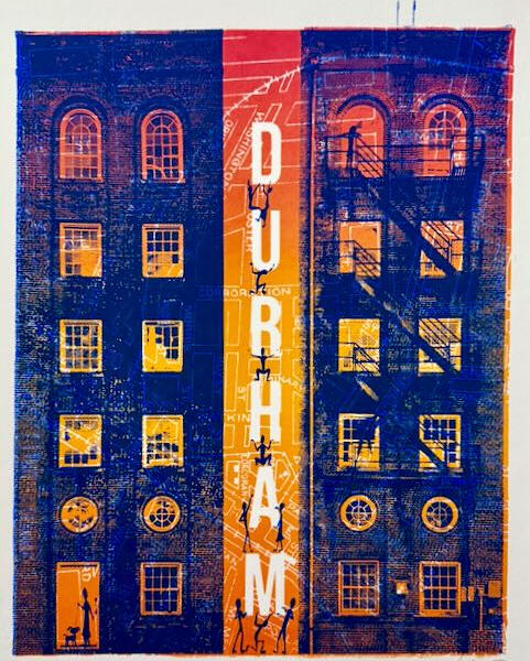
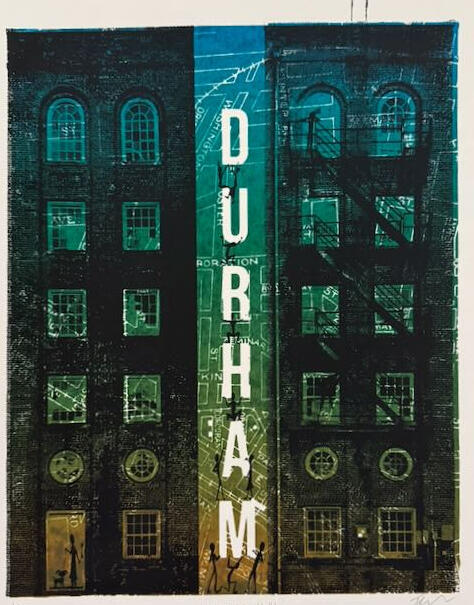
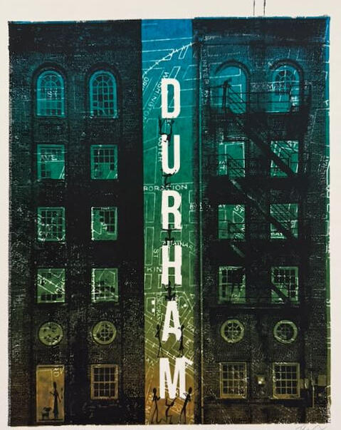
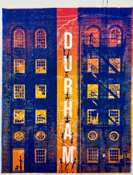
WLOFEOH (We Look Out For Each Other Here)
2025 Durham
Screenprint on Paper
13”x19”
#1 Dark Background, Edition of 3
#2 Orange Background, Edition of 6A classmate at Nightschool Bar mentioned the sense of neighborliness he felt in Durham. I felt it while walking my dog . But I also noticed how few people were out . Also many new buildings seemed half-empty. The fire training tower seemed like a good stand-in for my unease about what’s real and what’s not.
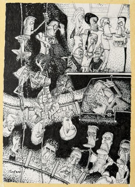
Cogs in The Machine
2025 Durham, 2003 Los Angeles
Pen and Ink
9”x12”I pencilled this image in LA in 2003, inspired by working in one of the larger effects studios. It stayed in storage for 22 years. After making a stippled version of No Fun I was inspired to finish it.
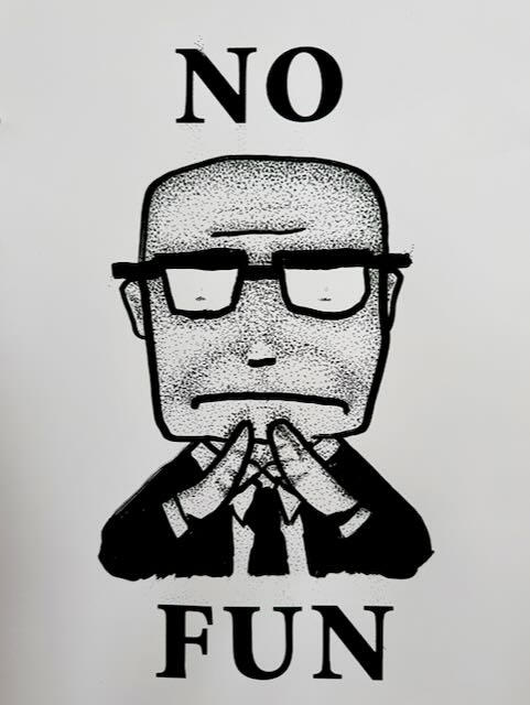
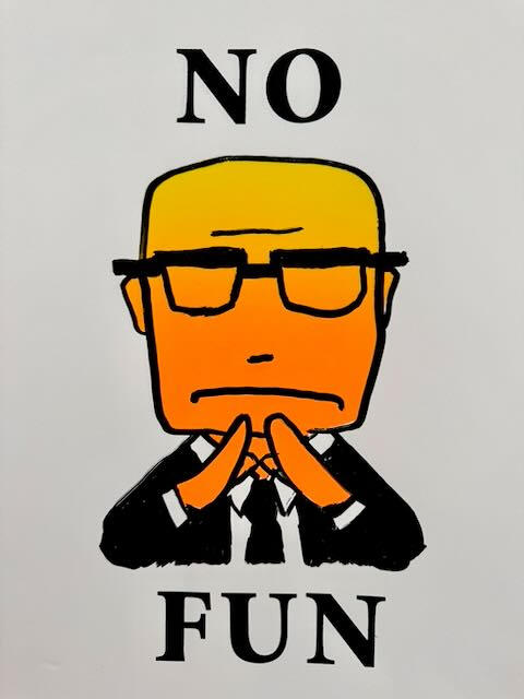
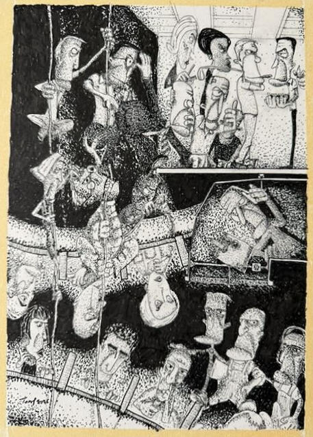
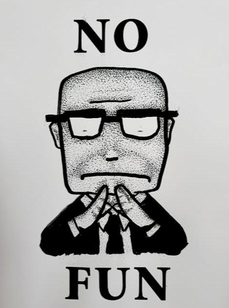
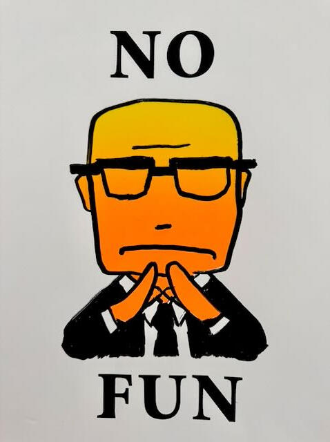
NO FUN
2025 Durham
Pen and Ink on Screenprint (B&W)
Screenprint (Color)
13”x19”
I took an afternoon class at SuperG print studio after moving here in November. I’m often called Captain No Fun for my tendency to say NO to impractical ideas.On a lark, I stippled one print inspired by Friedman Bros classic collection Any Resemblance to Person’s Living or Dead is Purely Coincidental. Stippling is completely impractical but relaxing and fun approach to making something 2D more dimensional.
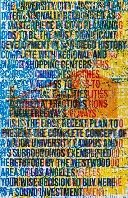
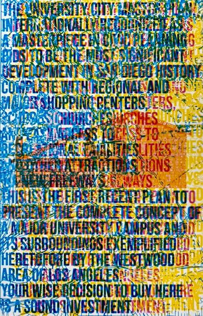
University Homes
2025 San Diego
ScreenprintThis image was inspired by a 1960s marketing brochure for the neighborhood I lived in. What used to be farmland was originally supposed to house professors and staff at the newly created UCSD nearby in La Jolla. I was exploring semi transparent overlaying of Cyan Yellow and Magenta over the mid-century style Orange house with contour lines and streets intersect ing with 3 versions of the marketing copy from the original brochure.
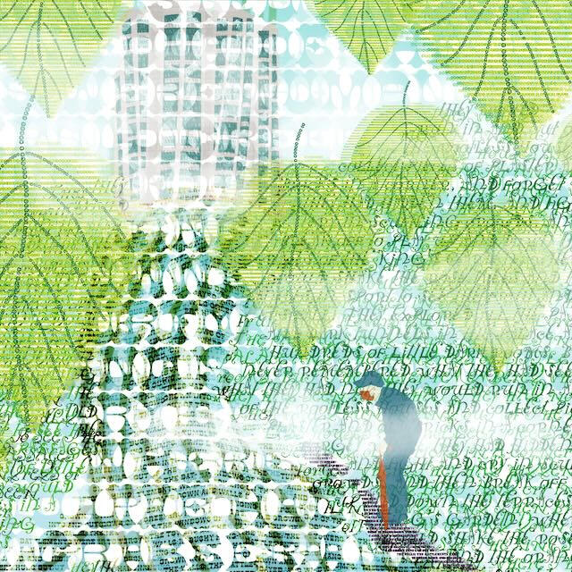
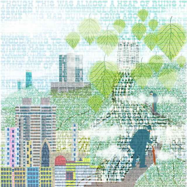
Bowen Road
2019 Hong Kong
Giclee Print
36”x36”
Despite its urban image Hong Kong has an immense area of undeveloped land with very accessible walking trails. Giant Banyan trees are a strong feature, growing over Victorian era public works .One any given day you can see a cross section of global humanity in all its shapes and sizes, styles of clothing from business suits to excercise attire in a luxury mall, street stall or on a hike.I couldn’t but help think of the monkeys inhabiting a ruined palace in the Disney film, Jungle Book which is based on Rudyyard Kiplings book of the same name. I was reminded of the fragility of our creations in the face of humidity, rain and jungle vegetation and that Kipling wrote this book while Hong Kong was being developed.The towers are what I saw from my apartment in a complex called Bamboo Grove.
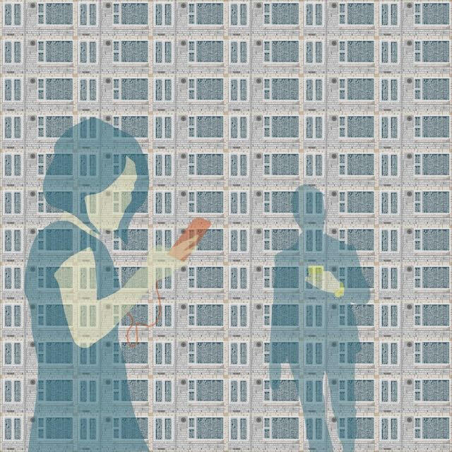
Bowed Head Tribe
2018 Hong Kong
Giclee Print
36”x36”
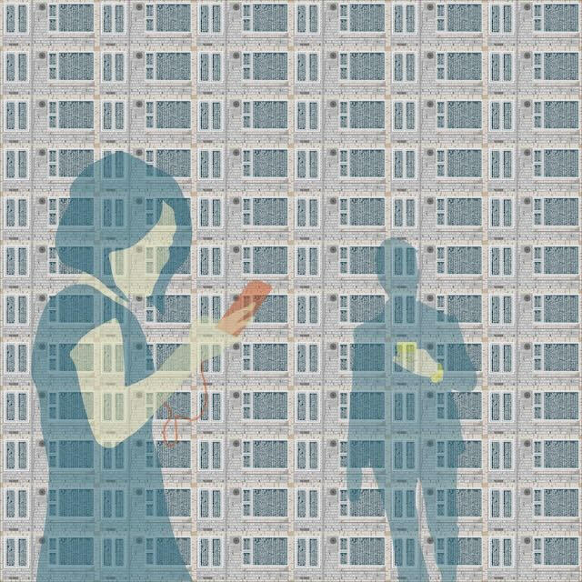
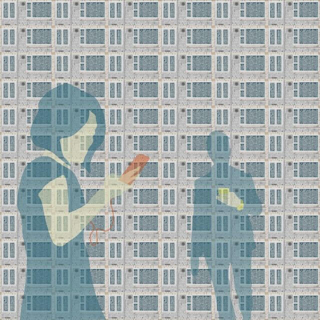
Compared to other big cities, Hong Kong seems over-run by a bowed head tribe or clan. So many people watch videos, surf the internet, update their social media, text their friends, order food, and play games while taking public transportation or walking to their next destination.
The piece has gone through several iterations as I wrestled with my first impressions of Hong Kong, how to show people abstractly without turning them into a caricature. Eventually the same issue on another unrelated project helped me settle on silhouettes.
The giant public housing projects reminded me of Le Corbusier's proposal of a city of tall buildings on pilotis surrounded by highways and parks as vision of the future in Towards a New Architecture.
Hong Kong has the tall buildings without the space for parks between the buildings.
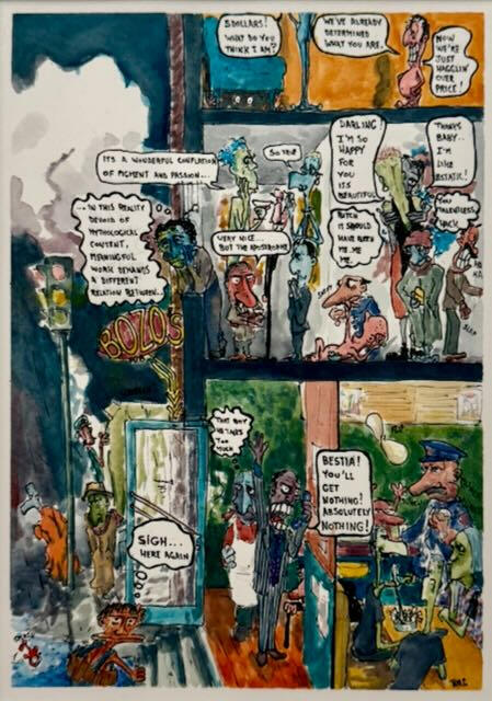
The Plateau
1994 Montreal
Watercolor over Pen & Ink
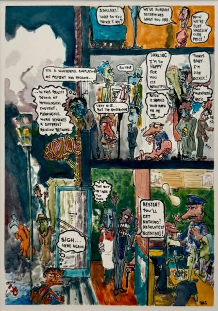
9”x12”Main, the nickname for St Laurent Blvd which historically demarcated Montreal’s English and French neighborhoods. By the 90’s the area near downtown called the Plateau was a cool destination for hipsters. Newer immigrants from Portugal, Italy, Greece, and Lebanon flavored area’s restaurants and offered a wider emotional range to conversations than what you would hear in a purely English or French context.
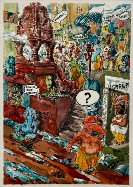
Varanasi
1994 Montreal
Watercolor over Pen & Ink
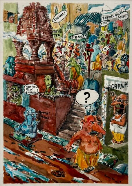
9”x12”After graduating from Architecture School I had an opportunity to work in India on research project sponsored by McGill University, CIDA and Arcop a Montreal based firm with an office in India. The older quarter of Varanasi is dense cluster of temples and guest houses on narrow paths that descend to ghats ..or steps along the Ganges river. Adjacent to religious practices at the temples and cremation ghats there are Westerner who seem in and out of year long trips along the hippie train from Nepal to Goa, and you can’t be in India without seeing the passion in a Indian demonstration